I am not a customer of Virgin Money i.e. I do not bank with them, so I have no direct experience of the Virgin Money brand, but I am aware of their visual branding. The curly 'M' in the word 'money' and the Virgin logo replacing the 'o' in money. I think this works well as a sub brand of the Virgin parent brand. Virgin's purpose is to "change business for good" and an emphasis can be made on the word 'good' to be both forever and for the greater good. Virgin Money merged with Clydesdale Bank in 2019 and Virgin Money is now a trading name of Clydesdale Bank plc. The Curvy 'M' in the name makes for a quirky logotype and I think it carries off the message of the person who does business differently. Overall I think this is the strongest brand in the Virgin stable of brands and I believe it has the potential to be everlasting.
Friday, 25 February 2022
Thursday, 24 February 2022
Community Quiz Poster
I recently designed this poster for a community quiz for an organisation called A Heart for Duns. The client was pleased with the design.
Thursday, 17 February 2022
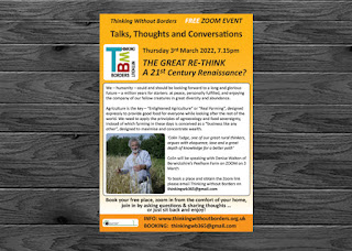
New Flyer Design
I recently designed this flyer for an organisation called Thinking Without Borders. The client supplied all the details and I put it together. This is the third one I have done for them. I think they are happy with it.
Subscribe to:
Comments (Atom)


